
Golden View
Role: UX/UI Designer
Timeline: 8 weeks
Tools: Figma, Adobe CC, Miro, Canva
Type: Mobile UX Design
A unified transit mobile app designed specifically for San Francisco Bay Area commuters, combining BART and ACE train services into one seamless experience. As the UX/UI designer, I led the end-to-end design process, research, branding, prototyping, and interaction design to create an app that simplifies multi-transit navigation while celebrating San Francisco's iconic visual identity.
🌉 Golden View
What's Missing from Bay Area Transit?
Bay Area commuters juggle multiple apps to plan their journeys. BART serves South and East Bay to San Francisco, while ACE connects the Central Valley and the South Bay but doesn't reach the city. Users must switch between apps, check separate maps, and navigate disjointed experiences just to complete one trip.
How might we design a unified transit app that simplifies Bay Area commuting while capturing the essence of San Francisco?
Drawing Inspiration from the City
I was inspired by the colors of San Francisco—a mobility app had never been designed solely around a city's visual identity. From the iconic Golden Gate Bridge to the city's coastal fog and vibrant neighborhoods, I translated San Francisco's character into a cohesive brand.
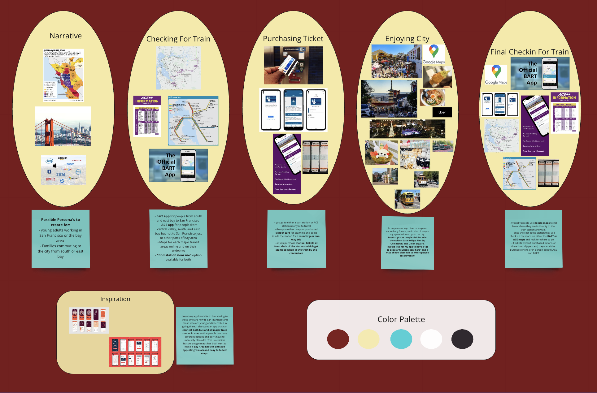
Meet The Commuters
The primary users are young professionals—including tech workers, creatives, and service industry employees—who commute daily from the South Bay and East Bay to San Francisco, valuing efficiency, real-time information, and opportunities to explore the city after work. Secondary users include families from the South and East Bay who take weekend trips or visit for special occasions, requiring family-friendly planning tools, clear cost information, and simplified ticket management, particularly as they may be less familiar with Bay Area transit systems.
Current Pain Points
App fragmentation: Switching between BART and ACE apps mid-journey
Map confusion: Separate maps for each transit system
Navigation gaps: Using Google Maps to get to stations, then switching to transit apps
Ticket hassles: Buying tickets online, in-person, or managing Clipper cards across platforms
I incorporated an "Enjoying City" research section based on my young adult persona. Popular San Francisco destinations include:
Golden Gate Bridge
Pier 39
Chinatown
Union Square
Understanding these destinations informs wayfinding features and destination suggestions within the app, connecting transit with the city's cultural landmarks.
🗺️ Research: How Users Explore the City
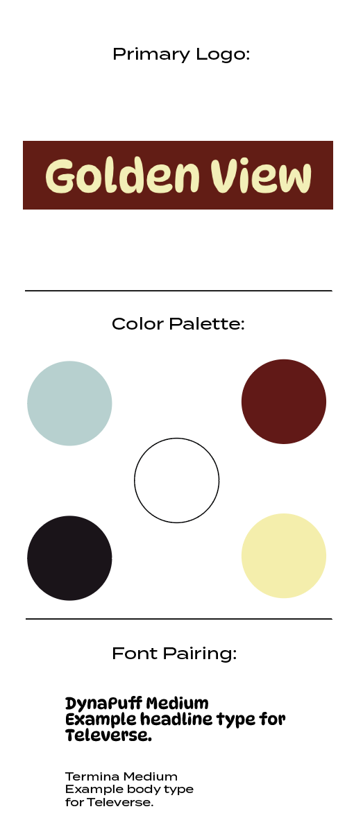
Color Palette & Style Guide
I modified my palette throughout the design process, ultimately selecting secondary and calm colors to ensure a tranquil user experience while still evoking San Francisco. The Golden Gate Bridge served as the primary inspiration for the color story.
For typography, I chose a playful, rounded bold typeface for headers to complement the custom interest icons and create an approachable, friendly feel. This created visual cohesion between the app's iconography and type system, while maintaining accessibility for body text, and balanced San Francisco's iconic character with a welcoming user experience.
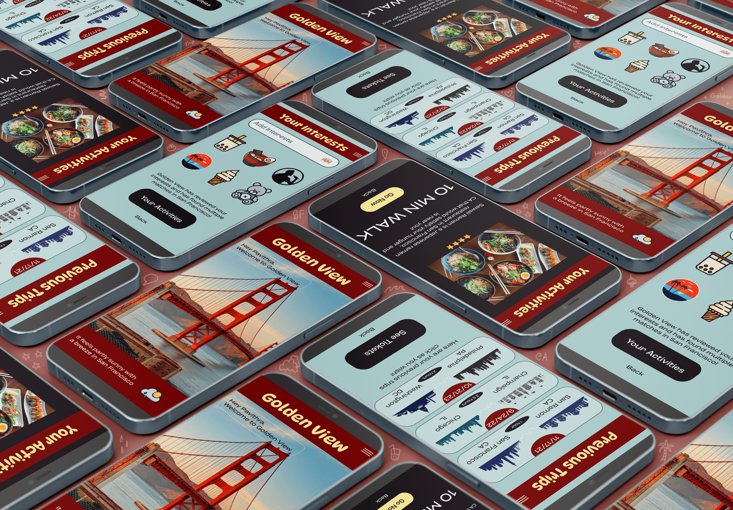
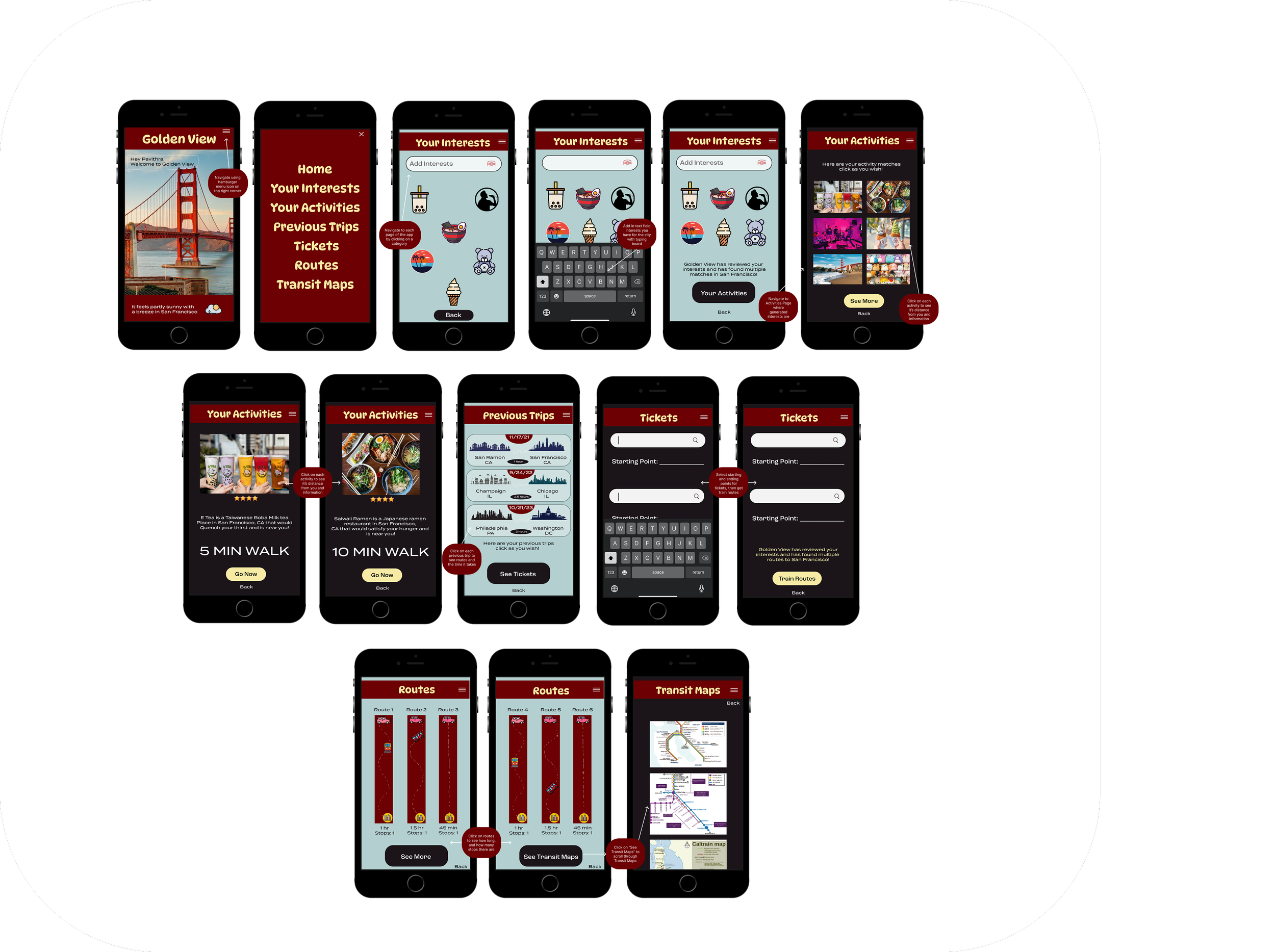
Home & Navigation:
Welcome screen featuring Golden Gate Bridge imagery and San Francisco landmarks
Navigation menu with: Home, Your Interests, Your Activities, Previous Trips, Tickets, Routes, and Transit Maps
Personalized interest selection with icons for local experiences (boba tea, dim sum, cable cars, food, music, etc.)
Core Features:
Interest-Based Discovery: Select activities and places you enjoy to get personalized recommendations
Activity Tracking: Save and rate visited locations with photos and star ratings
Suggested Walks: Get curated walking routes (5-10 min walks) connecting transit stops to local attractions
Trip History: Visual timeline of previous transit trips with dates and routes
Digital Ticketing: Enter the starting point and destination to purchase train routes
Route Planning: Browse and compare different transit route options with "See More" functionality
Interactive Transit Maps: Access Caltrain and other Bay Area transit system maps
Personalized Experience: Build your profile based on interests to discover San Francisco like a local
App Screens & Navigation
The app was prototyped in Figma & Adobe XD with interactive triggers
Design Decisions: The app delivers a unified experience by eliminating app-switching between BART and ACE services, while establishing a distinctive San Francisco identity through the city's signature colors and character. A calm color palette reduces transit anxiety, and simplified navigation transforms complex multi-transit journeys into intuitive, easy-to-follow flows.
What I Learned: This project taught me to balance visual identity with functional clarity in transit design, and how to serve diverse user groups—from daily commuters to occasional travelers. I discovered the critical role of real-time information in building user trust, and how thoughtful typography and color choices can evoke a sense of place and emotional connection.
Future Enhancements: Planned improvements include integration with additional Bay Area transit systems (Caltrain, Muni), social features for sharing routes with friends and family, enhanced accessibility features for users with disabilities, and gamification elements to reward and engage frequent commuters.
Key Takeaways
Golden View isn't just a transit app—it's a love letter to San Francisco. By unifying fragmented services and infusing every screen with the city's visual spirit, I created an experience that makes commuting feel less like a chore and more like part of the Bay Area lifestyle.
🌁 Bringing San Francisco to Life
