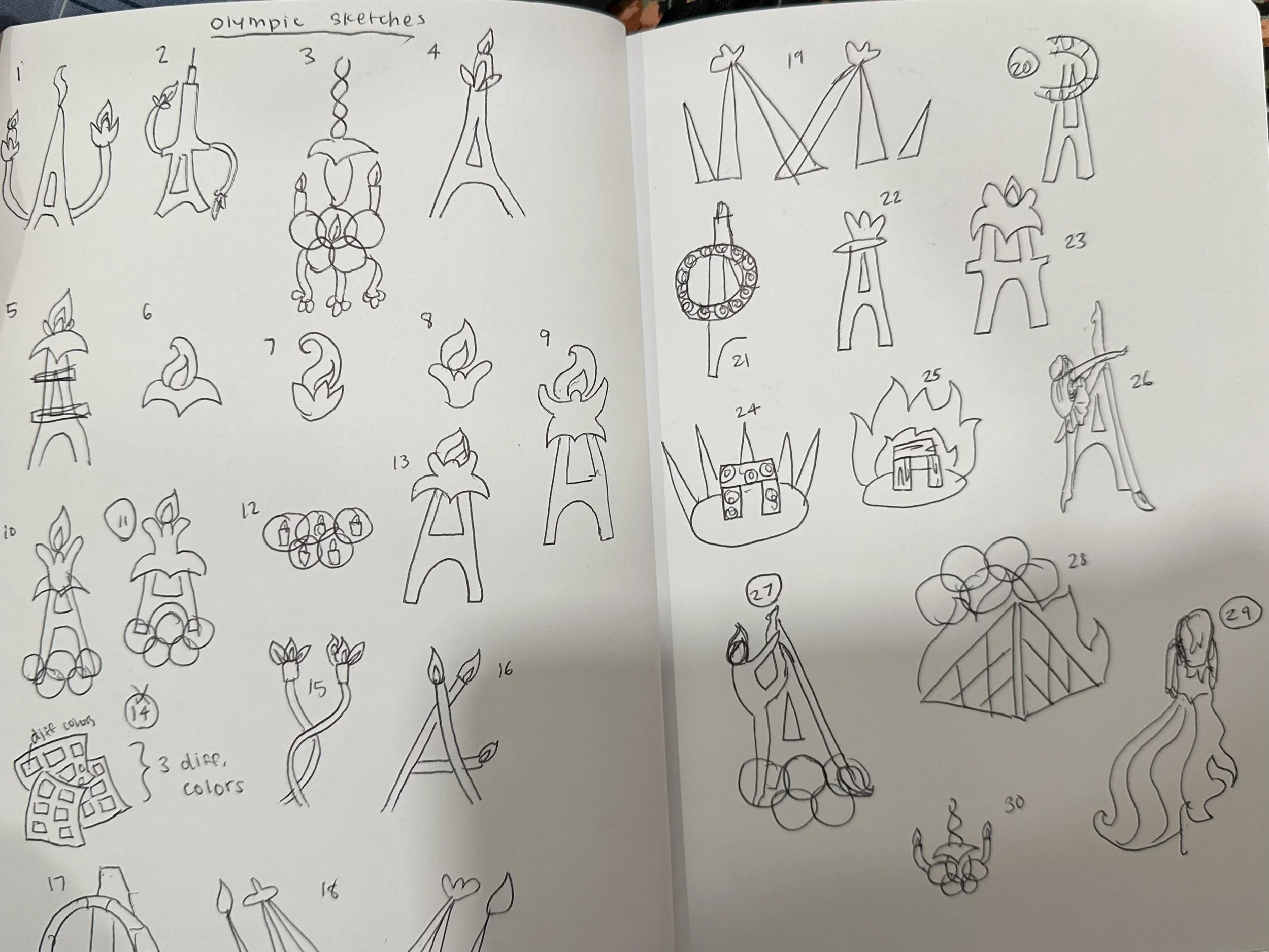
When I initiated my research, I stuck to three words: majestic, luminous, and aesthetic. This would shape my entire brand. Paris is known as the “city of lights” and grand architecture. From this, I picked out its specific geometry and the scene it has at night. I sketched out a few possible logos (on the left) and rounded them up to a separate diamond structure for my revised logo structure (on the right).
Initial Research
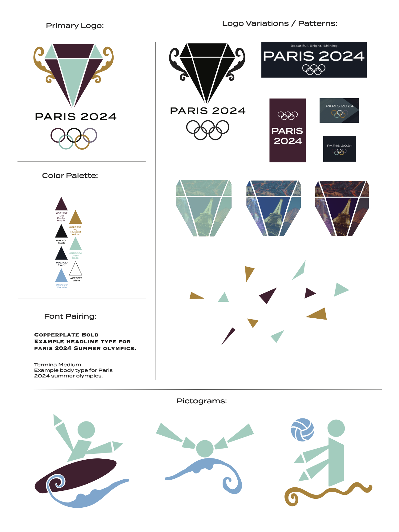
Style Guide
From this, I extracted its specific geometry and the nighttime scene of Paris. “Paris at night” was another phrase I made by brand follow. I was vastly interested in the colors shown at night and the triangular lines that made up the view of Paris. I have also picked components of curvy architecture that can be seen both inside buildings and outside on the streets of Paris.
My style sheet features a primary logo based on the diamond structure I designed in my sketching, to which I added a trophy-like effect on the sides with gold to symbolize grandeur. In the logo variations, I added scenes of the real city into each geometric structure of the diamond in different colors to show different aspects of “Paris at night”.
The color palette consists of contrasted bright and neutral colors to complement the shine of the city of Paris at night. At night, night lights shine gold and the ksy is navy blue/black.
For the font, I chose Copperplate Bold for the headline type of my brand, as it is bold and more vertical, which is symbolic of majesty for my brand. For the body type, I chose Termina Medium as it, in contrast, is more horizontal and complements the Copperplate Bold when seen together.
Pictogram + Poster
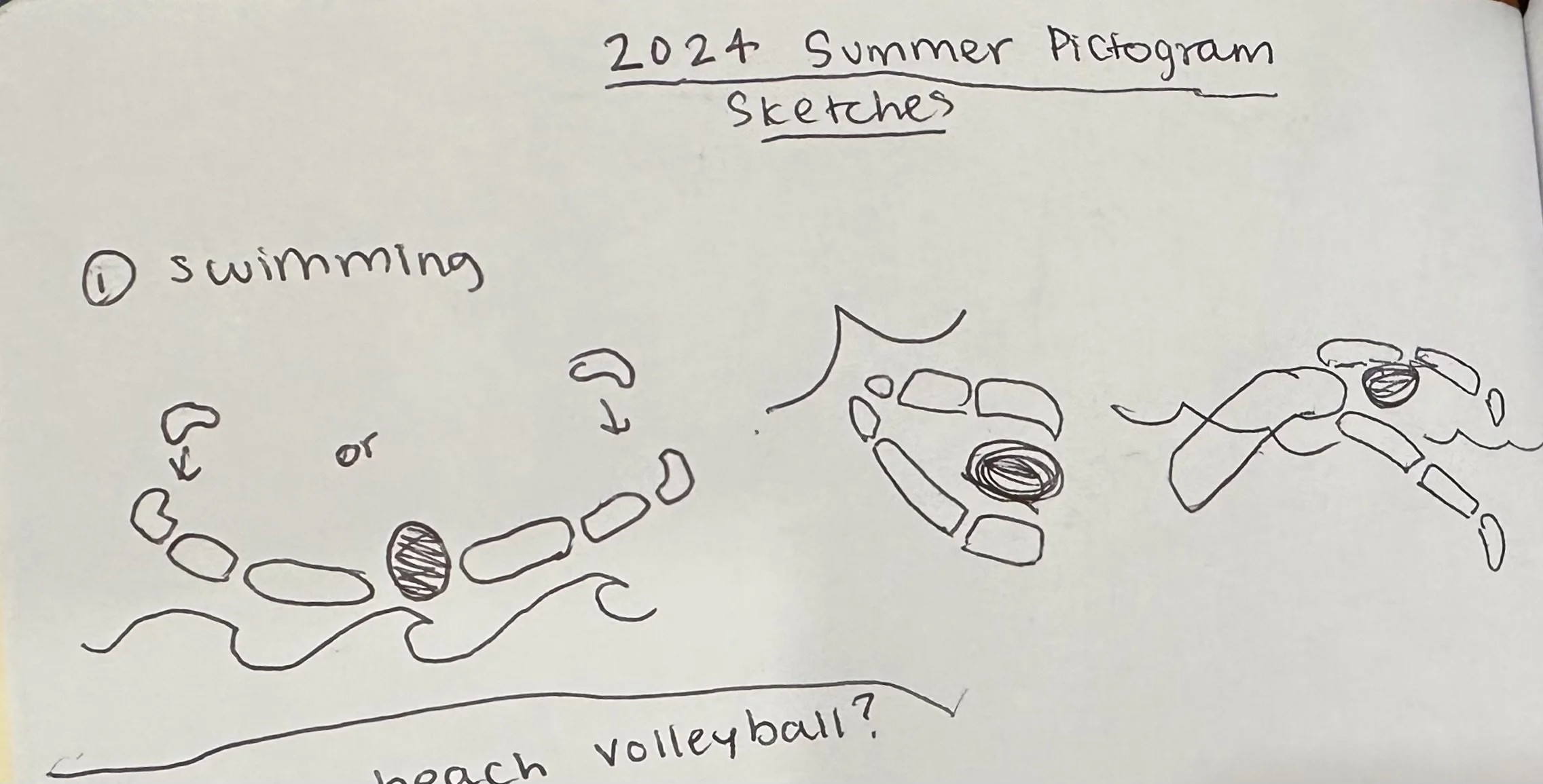
For the pictograms, I picked three summer Olympic sports for Paris. Surfing, swimming, and beach volleyball. These were shown with geometric human forms to complement my brand and add curves to the landscape.
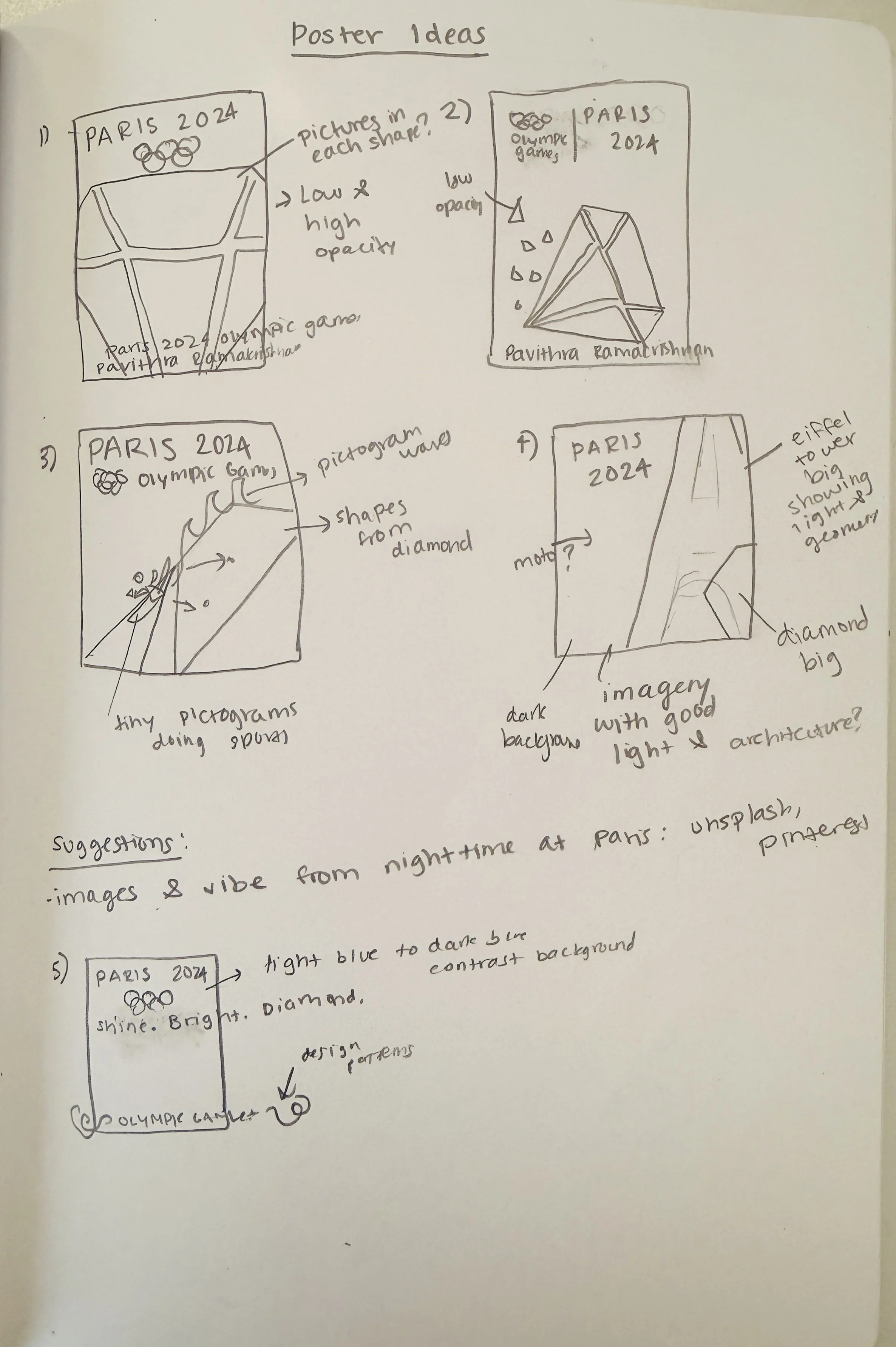
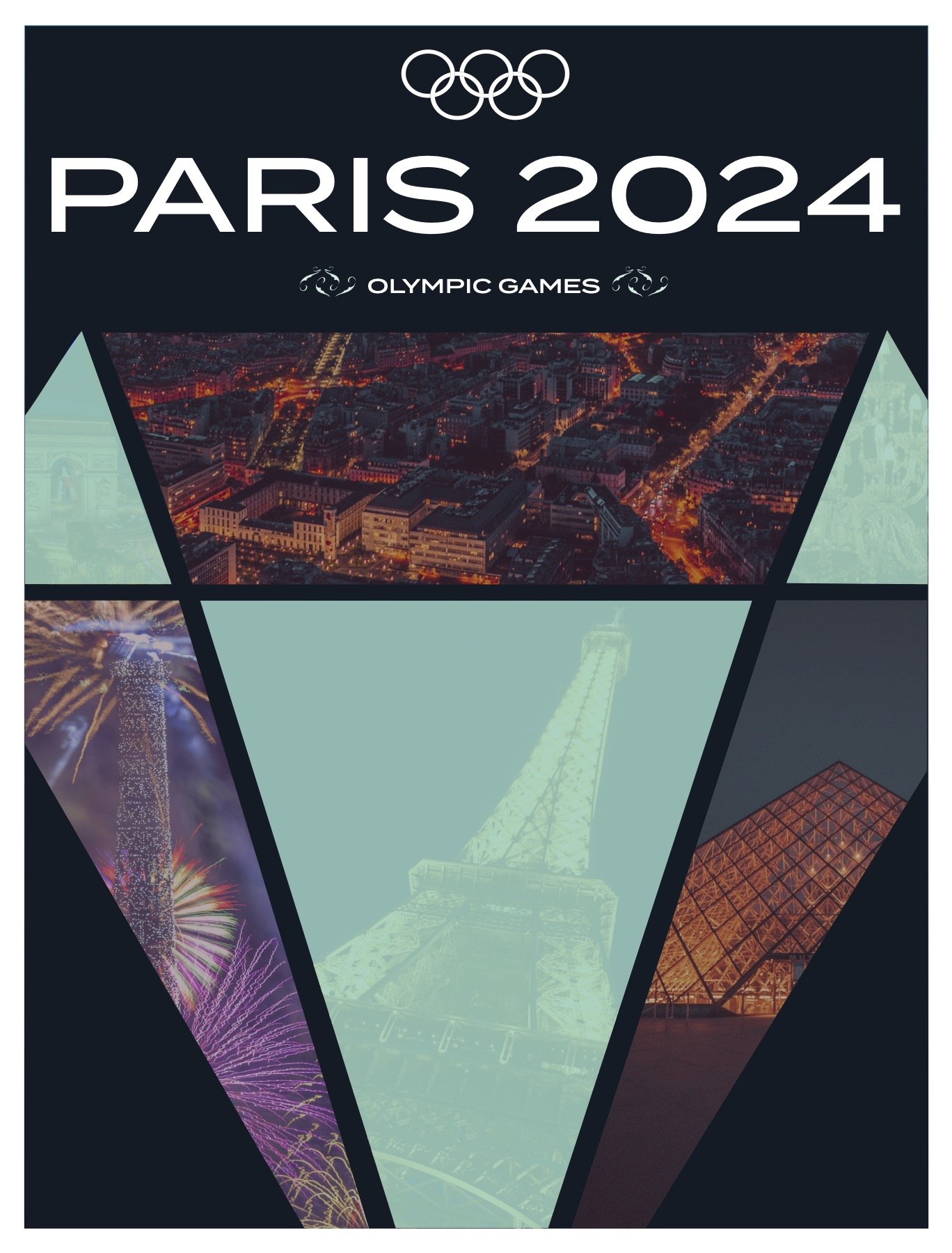
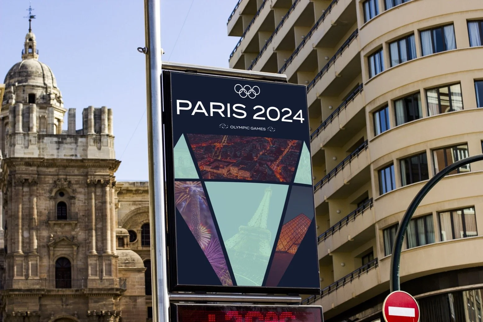
For my poster, I developed some sketch ideas. On the left, you can see the different variations. I wanted to make it obvious my branding was for the Paris 2024 Olympics, so of course I added the Olympic logo and rings in each of them. The general theme was the dark navy blue background, of course, to emphasize the nighttime in Paris. I was thinking of the pictures in each geometric structure of the main logo diamond. Then I was thinking of magnifying the type or logo and adding some patterns. I ended up with a combination of all of these.
Merch
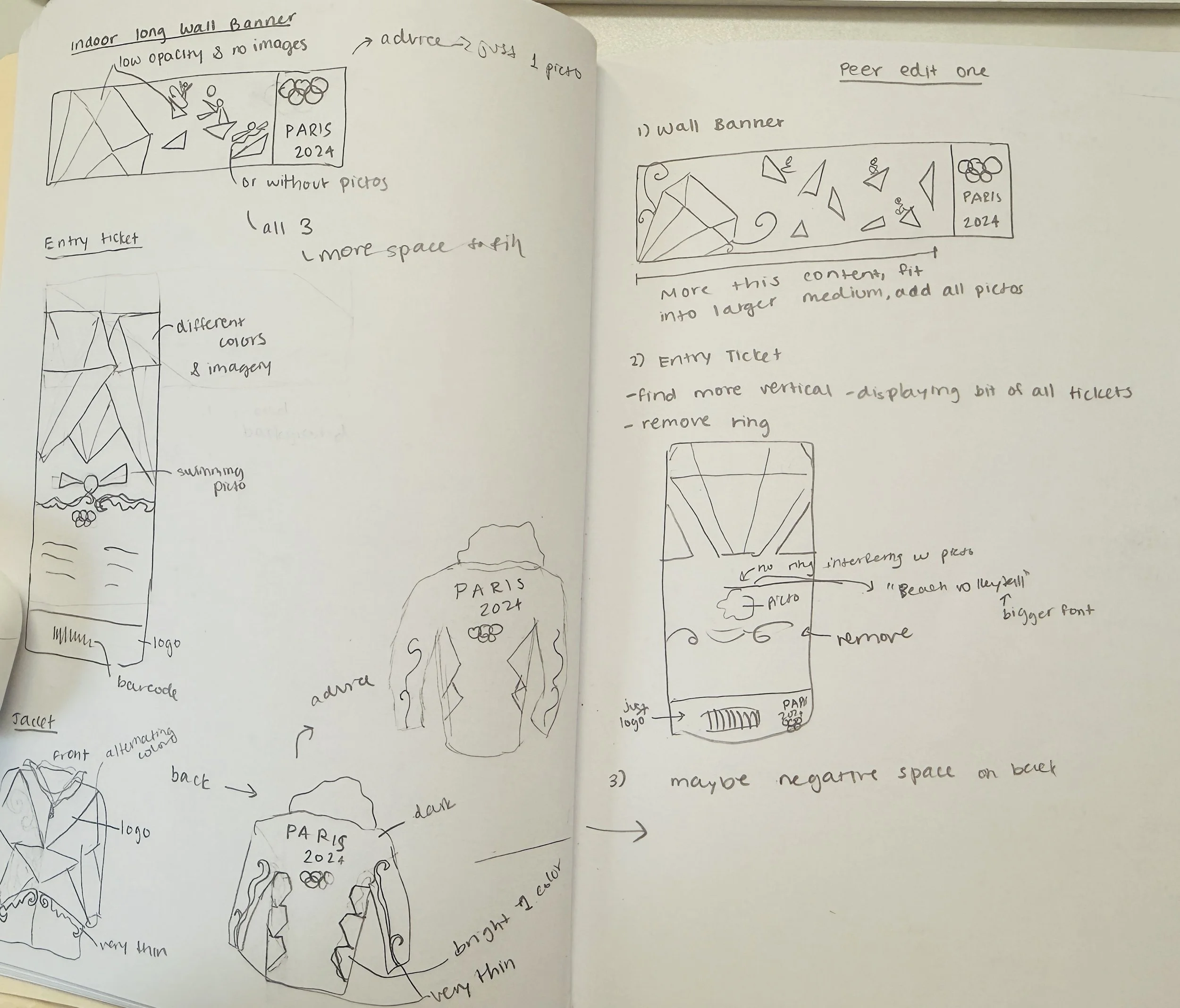
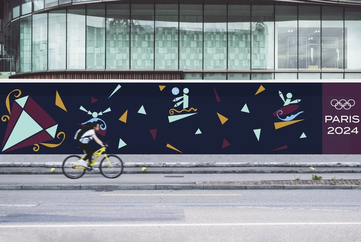
I started to develop merch for my brand. Here are my sketches on the right for my starting ideas for a wall banner, entry tickets, and jackets. For the wall banner, I was thinking of a long horizontal banner that incorporated fun geometrical patterns along with a tilting of the original logo, as well as three of the summer Olympic pictograms I made earlier on these patterns.
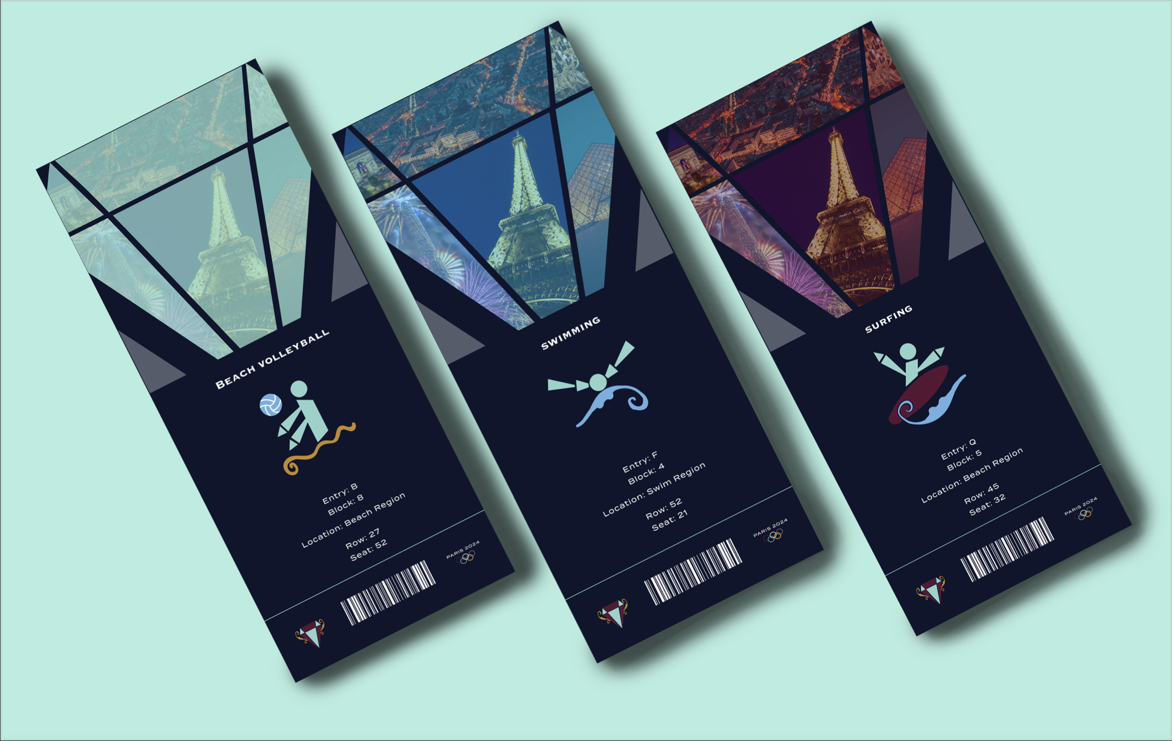
For my entry tickets, I was thinking of three tickets with different colors with imagery on each geometric structure of the main logo. I wanted a barcode on the bottom so consumers could scan these. In the middle, I was thinking of each sports pictogram and seeing information underneath.
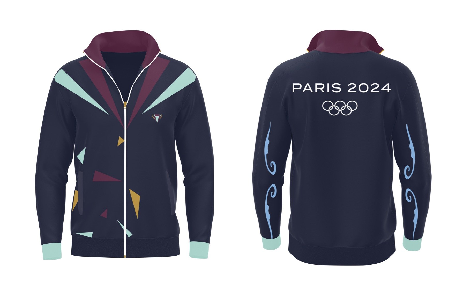
For the jackets, I incorporated a scheme similar to the wall banner, just in jacket format. I emphasized the geometric patterns and colors of my brand.
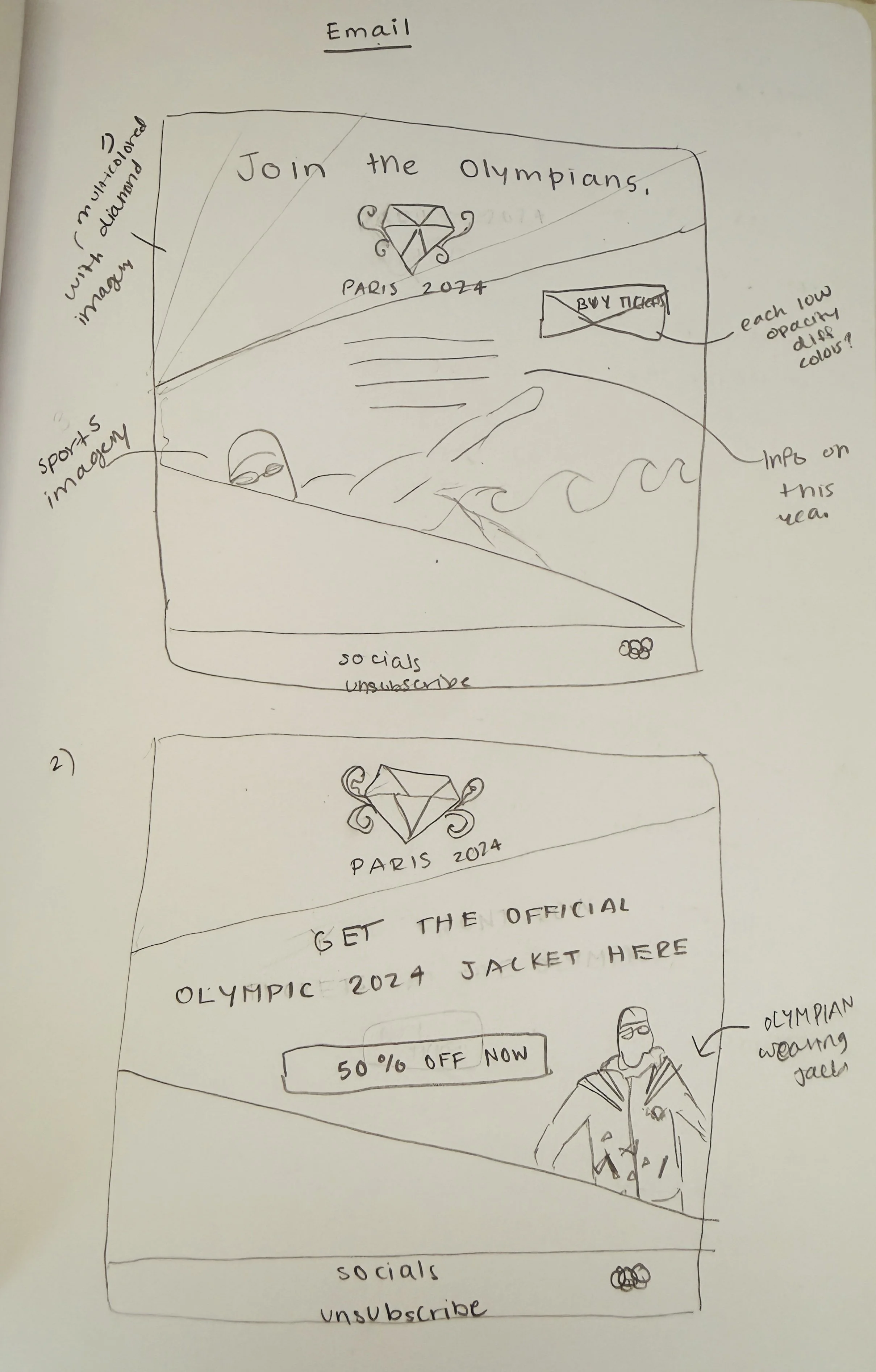
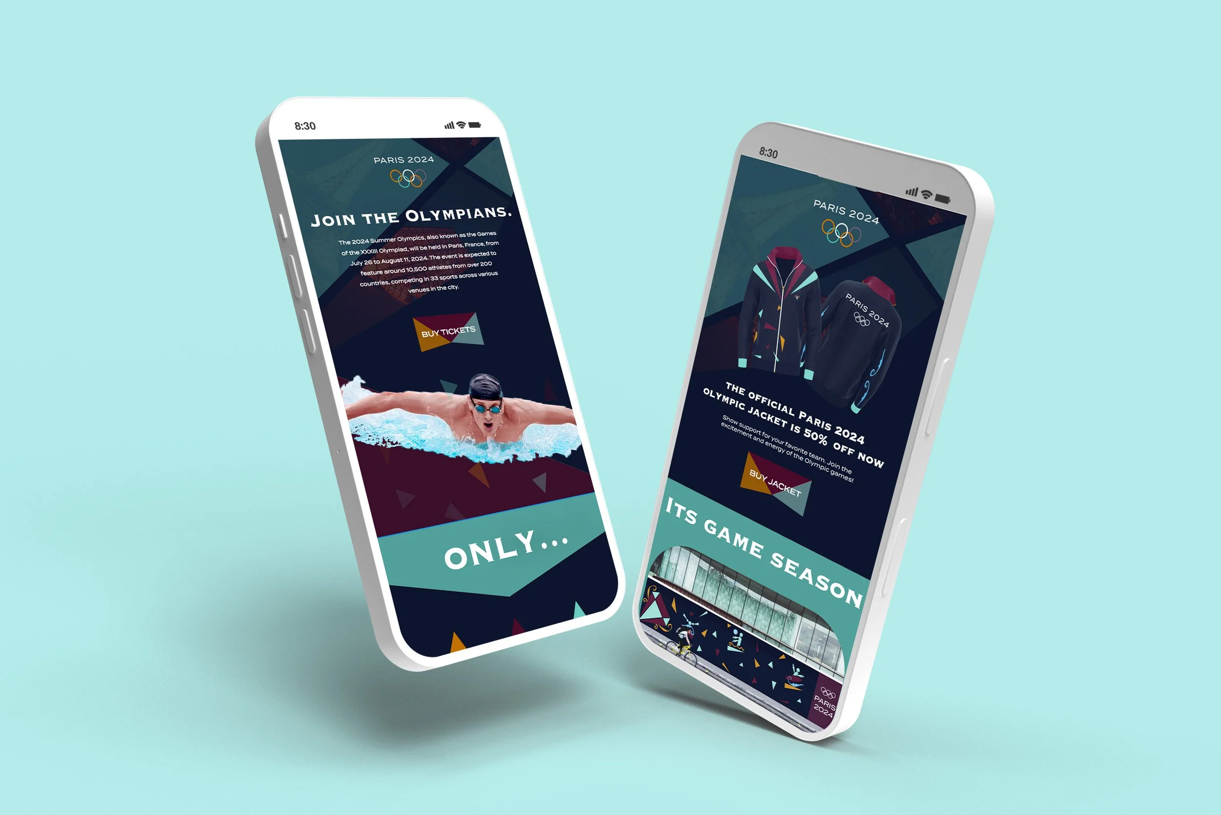
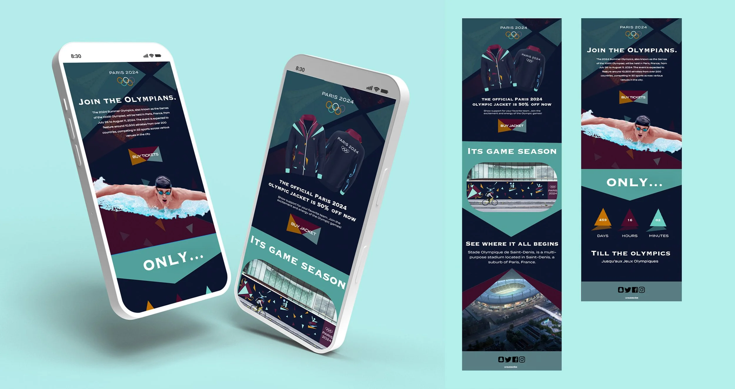
Finally, for my digital media, I made newsletter-style emails. These are mobile versions for now. The emails are also shown as mockups on an iPhone screen. The ideology behind these was to show promotion to users to grab their attention. This is why I had catchphrases such as big deals on merch, or the invitation phrase, “Join the Olympians.”, my intent was for the email to feel personal to the user. As can be seen, I’ve incorporated my merch from before into the emails in related situations, as well as informaiton on the official Paris stadium, a count-down till the Olympics (stated in french too), and email bottom headers with social media, etc. I made my designs to still connect to the colors of my brand and maintain that triangular form.